Large Format Signage Printing That Gets Seen
A sign can have strong branding, premium finishes, and a generous budget, then still fail for one simple reason: nobody can read it from where they are standing. That is the real test of large format signage printing. It is not just about making artwork bigger. It is about producing the right sign, at the right scale, on the right material, for the conditions where it will be seen.
For businesses managing retail sites, property campaigns, construction projects, events, vehicle fleets, or corporate locations, signage has a job to do. It needs to attract attention, communicate quickly, and represent the brand professionally. Getting those outcomes right starts well before the presses run.
What Large Format Signage Printing Needs to Achieve
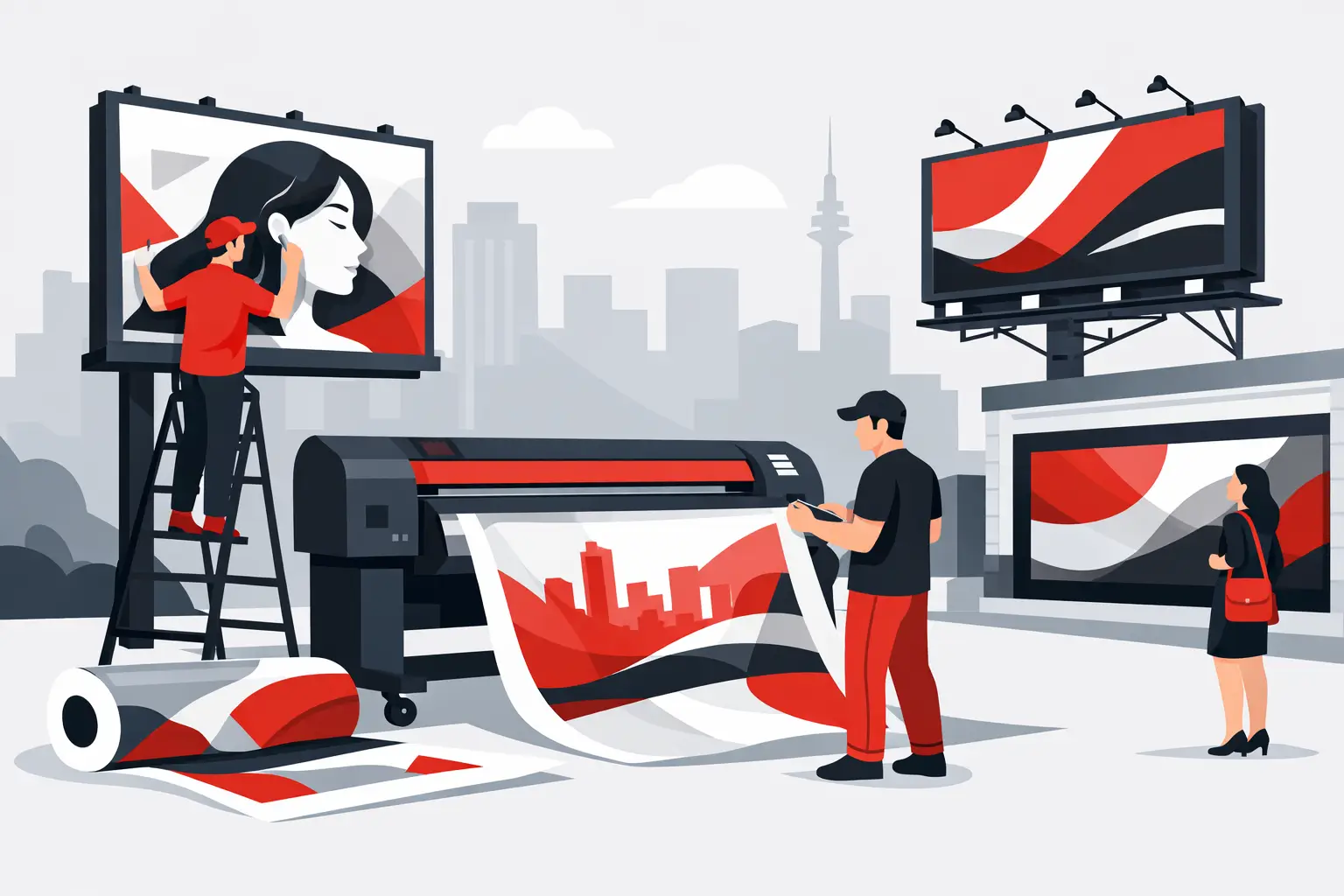
Large format signage printing covers a broad range of products, from window graphics and wall decals to outdoor banners, corflute signs, vehicle graphics, posters, point-of-sale displays, and rigid panels. These products may all be printed at a larger scale, but they are not interchangeable.
A building-site banner has to withstand wind, rain, and extended exposure to sunlight. A retail window graphic must suit the glass, the viewing direction, and the amount of natural light entering the space. A directional sign in a busy venue needs clear hierarchy, not a page full of messages competing for attention.
The best choice depends on where the sign will live, how long it needs to perform, and what action it should prompt. A short-term event sign can prioritize speed and value. Permanent exterior signage usually calls for more durable materials, protected inks, and carefully planned installation. Spending more where it matters can prevent a sign from fading early, peeling at the edges, or looking tired long before the campaign ends.
Start With Viewing Distance, Not Artwork
Most signage problems begin when a design created for a screen or brochure is simply enlarged. What looks balanced at arm’s length can become difficult to understand from across a parking lot, a storefront, or a busy road.
Viewing distance should shape every major design decision. The farther away the audience is, the fewer words the sign should carry and the larger the type needs to be. A roadside banner might need a business name, a short message, and one contact point. A reception wall graphic can support more detail because people have time to stand close and read it.
There is no single font-size formula that works for every location. Traffic speed, viewing angle, lighting, surrounding clutter, and the sign’s placement all affect legibility. A practical proof review should ask a simple question: what will people notice first, and can they understand the message in a few seconds?
This is also why contrast matters more than decorative effects. Dark type on a dark photo, pale lettering over reflective glass, or a busy background behind a call to action can weaken an otherwise attractive design. A sign does not need to say everything. It needs to say the most useful thing clearly.
Keep the message disciplined
For a campaign with several products or services, it can be tempting to include every offer, phone number, social handle, and accreditation. Large signs are rarely the place for that level of detail. Give the primary message room to work, then use QR codes, landing pages, brochures, or sales staff to handle the next step.
Brand consistency still matters. Correct logos, approved colors, and established typefaces help customers recognize the business quickly. For franchise networks and multi-site organizations, a controlled artwork process is especially valuable because it keeps local signage aligned with the broader brand.
Choose Materials for the Job, Not Just the Price
Material selection affects appearance, durability, installation, and total project cost. The least expensive option is not always the best value if it requires replacement sooner or creates problems during installation.
Vinyl is a common choice for window graphics, walls, vehicles, and smooth surfaces. Depending on the application, it can be removable, permanent, opaque, clear, perforated, or laminated for added protection. The surface condition matters. Dust, texture, moisture, old paint, and heat can all affect adhesion.
Corflute is lightweight and cost-effective for temporary real estate signs, event messaging, site boards, and directional signage. It is useful when signs need to be moved or replaced often, although it is not designed to deliver the same long-term rigidity as aluminum composite panel or other permanent substrates.
Fabric and vinyl banners offer flexibility for promotions, events, and large exterior messages. Mesh banner can be a smart option in windy locations because its perforations allow air to pass through. That trade-off is reduced image density, so artwork needs to be designed with the material in mind.
Rigid panels provide a more substantial finish for shopfronts, wayfinding, displays, and outdoor identification. They can be cut to shape and mounted in different ways, but their weight, fixing requirements, and exposure to weather should be considered early. The right substrate is part of the specification, not an afterthought.
Plan for Color, Light, and Weather
Brand colors that look exact on a monitor can shift when printed, particularly across different materials. Lighting changes the result again. A sign viewed under retail LEDs may appear different from the same sign in direct afternoon sun.
For brand-sensitive work, provide approved color references and discuss what needs to match most closely. Some colors are more difficult to reproduce consistently than others, especially bright fluorescents, metallic finishes, and certain saturated blues or oranges. A physical proof or material sample can be worthwhile for major rollouts, high-visibility locations, and projects with multiple components.
Outdoor conditions deserve the same attention. Sun exposure can fade unprotected prints over time. Rain can find weak points in hems, eyelets, joins, and mounting holes. Wind can turn an oversized banner into a safety issue if the fixing method is under-specified. A reliable print partner will ask where the sign is going, how long it will be installed, and how it will be mounted before recommending a production approach.
Build Installation Into the Project Schedule
A finished sign is only half a finished job. Installation is where measurements, access, site preparation, and fixing methods become critical.
Before production, confirm the final dimensions from the actual site rather than relying on old plans. Measure windows, walls, frames, fences, and existing sign faces carefully. Note obstacles such as door handles, light fittings, cameras, uneven surfaces, power lines, or restricted access times. For vehicle graphics, confirm the exact make, model, wheelbase, and panel configuration.
Installation should also influence the artwork. Allow for bleed, safe margins, panel joins, trim areas, eyelets, and folds around edges. If a window graphic is applied internally to face outward, the artwork may need to be reversed. If several panels create one large image, the joins should avoid critical text and faces where possible.
Projects with a fixed opening date benefit from working backward from installation. Allow time for artwork approval, proofing, production, finishing, delivery, and any site coordination. Rushing the final stage is one of the fastest ways to create avoidable errors.
Prepare Files That Print Cleanly at Scale
Large-format equipment can produce impressive detail, but it cannot repair low-resolution images or unclear artwork. A small web image may look acceptable on a laptop and become visibly pixelated when printed across a wall.
Use high-resolution source images and vector logos wherever possible. Vector files keep logos, icons, and type sharp at large sizes. Images should be supplied at an appropriate resolution for their final viewing distance, rather than automatically using the same standard for every job. A wall mural viewed close up needs more detail than a billboard viewed from a distance.
Set up artwork with the intended finished size, required bleed, and a clear indication of cut lines or finishing instructions. If you are unsure, ask before finalizing the file. Design support is often faster and more cost-effective at the beginning of a project than correcting files after production has started.
Make Signage Easier to Manage Across Multiple Locations
For businesses with branches, franchises, property teams, or recurring campaigns, the operational side of signage matters just as much as the printed result. Reordering should not mean rebuilding artwork, chasing old emails, or wondering which version of the logo was approved.
A structured ordering process can keep templates, specifications, quantities, and site-specific details organized. It reduces the chance of inconsistent messaging and helps local teams order approved materials without losing control of the brand. This is particularly useful for real estate boards, retail promotions, safety signage, corporate displays, and campaign kits sent to multiple locations.
Dynamite Printing supports projects from artwork and material selection through production, finishing, and fulfillment. That matters when a job involves more than one sign type or has a deadline that cannot move. One team taking ownership of the details makes the process easier to manage.
The most effective sign is rarely the one with the most design elements. It is the one that meets its audience where they are, holds up in its environment, and makes the next action obvious. Start with the site and the message, then let the material, scale, and production method follow.