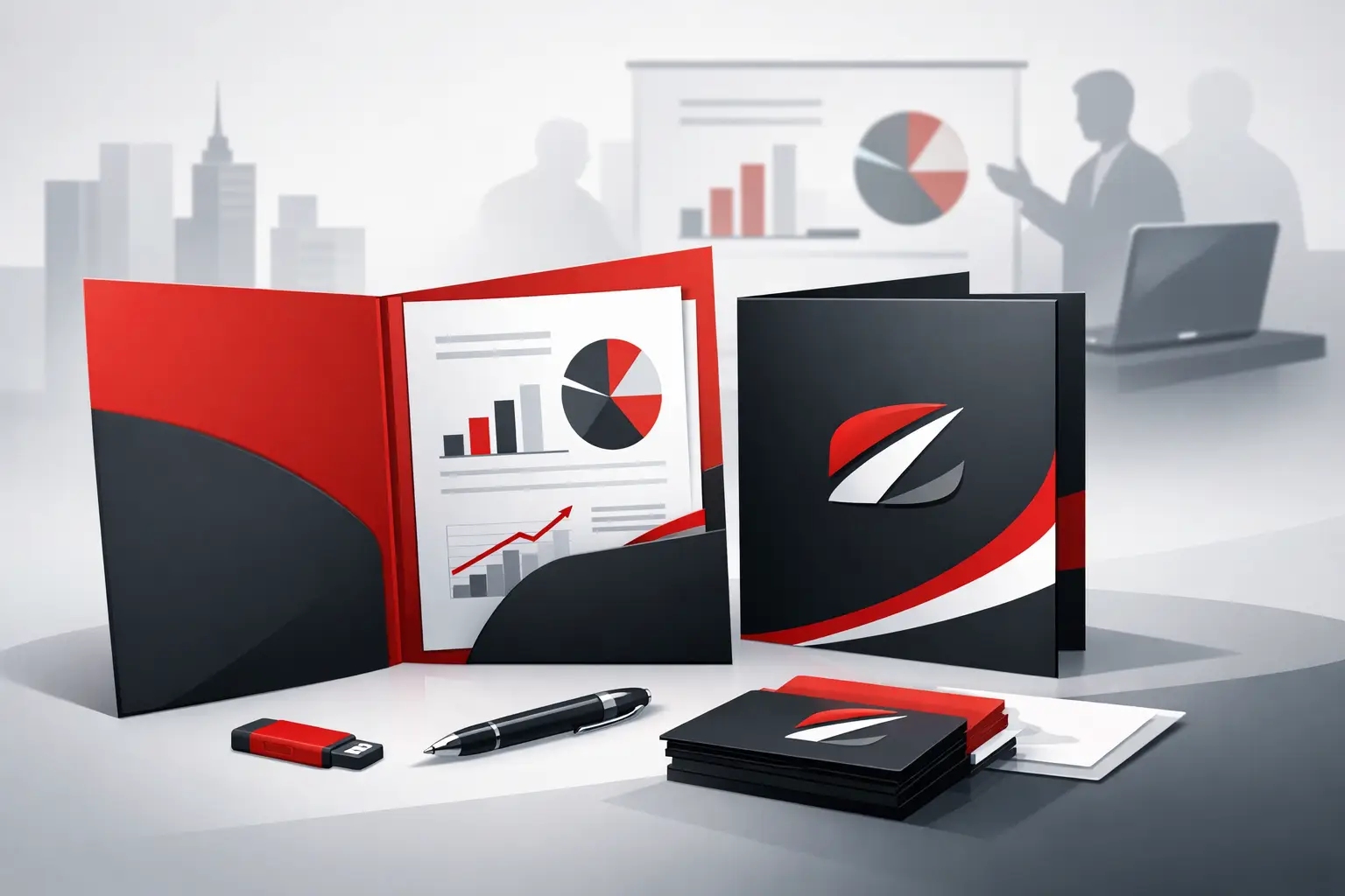
Presentation Folder Printing That Looks Sharp
A presentation folder usually gets judged before the documents inside it do. If it feels flimsy, looks off-brand, or falls apart after one meeting, that reflects on your business straight away. Good presentation folder printing does the opposite – it gives proposals, welcome packs, sales material, contracts, and capability statements a more professional edge before a single page is read.
For many businesses, folders are not just packaging. They are part of the pitch. Real estate agencies use them to hold property documents. Corporate teams use them for board papers and tenders. Franchise groups use them to keep branding consistent across locations. Designers and trade buyers often need them to look right, print cleanly, and arrive on time without chasing multiple suppliers. That is where the details matter.
What presentation folder printing actually needs to do
A good folder has a simple job – hold content securely and present your brand properly. But in practice, there is more going on. It needs to survive handling, stack neatly, fit the inserts you plan to use, and print well across solid colors, logos, text, and imagery.
That means the best result is rarely about choosing the cheapest option on a price list. It is about matching the folder to its use. A sales team handing out folders at meetings may want a clean, efficient format with business card slits and a durable finish. A premium proposal pack for a high-value client may need heavier stock, special finishing, and tighter attention to detail. An internal HR welcome pack might prioritize practicality and consistency over embellishment.
The right choice depends on how the folder will be used, how often it will be handled, and what impression it needs to create.
Choosing the right stock for presentation folder printing
Stock affects almost everything – feel, durability, print quality, and perceived value. If the board is too light, the folder can feel cheap and bend easily. If it is too heavy without the right crease and construction, it may crack at the folds.
That is why board selection should be based on real use, not guesswork. A standard corporate folder often works well on a sturdy coated stock that gives good color reproduction and enough rigidity to hold multiple sheets. For a more tactile, understated look, an uncoated stock can work, especially when the design leans on typography rather than heavy imagery. The trade-off is that uncoated stocks usually show scuffing differently and will not deliver the same punch in photographic color.
Lamination or protective coating can also make a real difference. Matte lamination gives a refined, modern feel and helps reduce wear. Gloss lamination can lift color and add shine, though it is not always the best fit for every brand. If folders are going to be handled often, carried to appointments, or stored for future use, that extra protection is often worth it.
Folder size, pocket style, and capacity
This is where practical decisions save headaches later. A folder that looks good in a mock-up can become frustrating if it does not fit the material properly.
Most businesses choose standard letter-size or A4-style presentation folders because they suit common document sizes and are easy to store. But the pocket depth, spine capacity, and overall construction still need attention. If your folder will hold only a few pages, a slim format may be enough. If it needs to hold brochures, forms, inserts, and a business card, you may need a gusseted spine or expanded capacity.
Pocket design matters as well. One pocket may suit a simple handout. Two pockets often make more sense for proposals, onboarding packs, and sales kits because they keep sections organized. Business card slits are useful, but only when they are placed and cut properly. They should feel intentional, not tacked on.
A common mistake is designing the folder before confirming what will go inside it. It is better to start with the inserts and work backward. That prevents overstuffed pockets, awkward bulging, and wasted print spend on a format that does not do the job.
Design choices that help folders look professional
Presentation folder printing works best when the design respects the format. A folder has folds, pockets, glued areas, and visible front and back panels. It is not just a flat sheet.
Strong folder design usually keeps the outside clean and purposeful. A clear logo, confident use of brand color, and well-managed white space often work harder than trying to fill every panel. Inside, the design should support usability. Contact details, a short company message, or a subtle brand element can add polish without making the inside feel cluttered.
Small production details matter too. Fine borders near edges can look uneven if tolerances are not considered. Heavy ink coverage across fold lines may increase the chance of cracking if the stock and finishing are not suited to it. Light text over busy backgrounds often looks better on screen than in print. These are the kinds of issues that are much easier to solve before production starts.
For branded businesses with multiple locations or teams, consistency matters just as much as creativity. If one branch is using navy, another is using royal blue, and a third has stretched the logo, the folder stops doing its job. A well-managed print process keeps brand standards under control.
Finishing options in presentation folder printing
Finishing can elevate a folder, but only when it supports the brand and purpose. Foil, spot gloss, embossing, or specialty laminates can create a premium feel. They can also add cost, lead time, and complexity.
That does not mean they should be avoided. It just means they should be chosen carefully. A law firm preparing high-value proposal documents may benefit from subtle embossing and a matte laminate. A property developer launching a premium project may want a more striking visual finish. A fast-moving sales team replenishing stock regularly may get better value from a simpler, durable specification that can be reordered efficiently.
There is always a balance between impact, budget, and turnaround. The best choice is the one that fits the job, not the one with the longest list of extras.
Why timing and workflow matter
Folders are often part of a bigger job. They may need to align with brochures, flyers, forms, inserts, signage, or direct mail pieces. That means timing matters more than many buyers expect.
If folder printing is treated as a stand-alone item, problems can show up late. The inserts may not be finished. The final page count may change. The artwork may be approved after the print window has narrowed. Suddenly a straightforward order becomes a rush job.
A better approach is to treat the folder as part of the whole package from the start. Confirm what goes inside it, how it will be distributed, and when it needs to land. If multiple printed components are involved, coordinating them through one production partner can reduce errors and save time. That is especially useful for corporate teams, franchise networks, and agencies managing recurring campaigns or multi-location rollouts.
When custom is worth it and when standard makes sense
Custom presentation folder printing can give you a better fit, stronger brand presence, and more useful functionality. It is often the right move for businesses that use folders regularly, present to clients face-to-face, or need a format tailored to specific content.
At the same time, custom is not always necessary. If your goal is a practical folder for standard inserts, a proven format with smart branding may do the job perfectly well. Going fully custom for the sake of it can add cost without improving results.
This is where experience helps. The right advice is not always about upselling a more complex product. Sometimes it is about knowing when a standard configuration will perform better, print faster, and stay on budget.
What business buyers should ask before approving a job
Before signing off on presentation folder printing, it is worth checking a few practical points. Will the stock and finish suit the way the folder will be handled? Does the pocket size match the actual insert set? Is there enough spine capacity? Have the folds, glue areas, and card slits been considered in the artwork? Does the production timeline line up with the rest of the campaign?
Those questions are not glamorous, but they are what separate a smooth job from a frustrating one. A folder is supposed to make your material look organized and credible. If it splits, scuffs badly, or does not fit its contents, it creates work instead of solving it.
For businesses ordering at scale or across multiple teams, consistency is another key check. Repeatable specs, dependable print quality, and clear production support matter far more over time than shaving a little off a single order.
Presentation folders still earn their place because they do something digital files cannot – they make information feel considered, tangible, and ready for action. If the folder is built properly, it does more than hold paper. It helps your business show up looking prepared.