Business Cards: Foil, Texture, Plastic, and More
A standard business card can do the job. It shares your name, title, number, and logo. But when you start looking at business cards – foil, texture, plastic, etc. – you move from basic contact details to brand signal. The card starts telling people what kind of company you are before they read a word.
That matters more than many teams expect. In a sales meeting, at a property inspection, during a trade event, or when a referral changes hands, the card becomes a quick test of professionalism. If it feels cheap, cluttered, or gimmicky, that impression sticks. If it feels considered and well made, people assume the same about the business behind it.
Why finish matters on business cards
The finish is not decoration for its own sake. It changes how people physically experience your brand. A heavy uncoated stock feels different from a glossy laminated card. Foil catches light and draws the eye. A textured sheet adds tactile interest. Plastic changes durability and gives a more modern, non-paper look.
The right choice depends on context. A law firm, luxury builder, real estate group, creative agency, and field service business can all need business cards, but they should not all hand out the same card. Good print decisions are rarely about what looks most impressive on a sample board. They are about what fits the brand, the audience, and the way the card will be used.
Business cards – foil, texture, plastic, etc. compared
If you are deciding between special finishes, start with the impression you want to create and the practical conditions the card has to survive.
Foil business cards
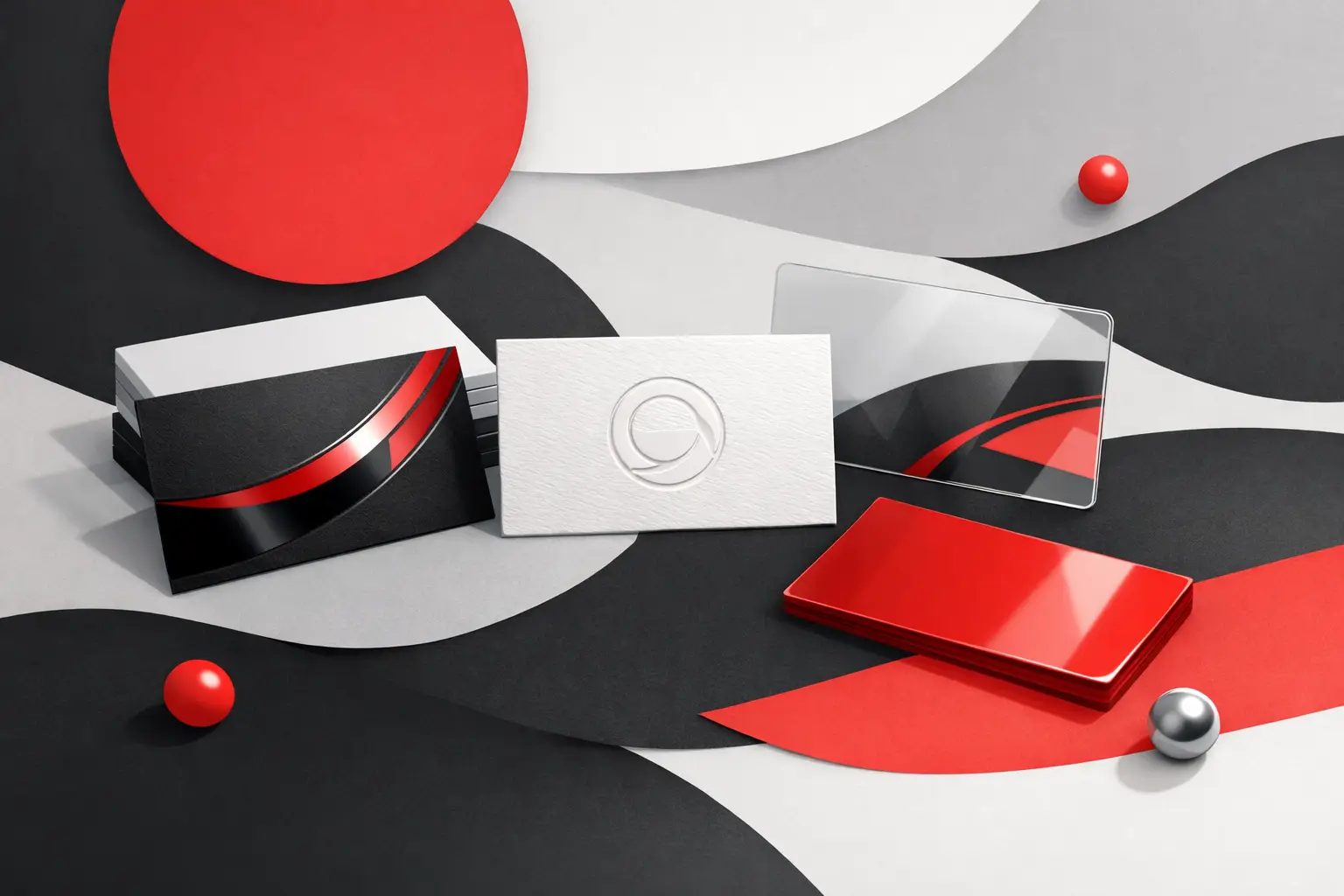
Foil adds metallic shine to selected elements, usually a logo, name, border, or headline detail. Gold and silver are common, but other foil colors are available depending on the look you want.
Foil works well when you want a premium feel without changing the whole design. It suits brands that need polish and confidence – property, finance, hospitality, beauty, and high-end retail are typical examples. Used well, it makes a card feel more intentional and more expensive.
There is a trade-off. Foil is strongest when the design is restrained. Too much foil can make a card harder to read and easier to dismiss as overdone. Fine details also need careful setup, because foil does not behave the same way as standard ink on press. If your artwork is busy, the finish can fight the design instead of improving it.
Textured business cards
Texture changes the feel of the stock itself. Think linen, laid, felt, or other tactile paper surfaces. This approach is less about shine and more about character.
Textured stocks often suit brands that want warmth, craftsmanship, or a more established tone. Architects, consultants, boutique service firms, designers, and premium trades can all benefit from texture when it matches the rest of their identity. A subtle texture can make a simple card feel more refined without shouting for attention.
The trade-off is print behavior. Some textured papers do not reproduce solid areas and fine type as crisply as smoother stocks. If your design uses heavy ink coverage, very small text, or fine reverse details, you need to check whether the chosen stock supports it. Texture should never compromise legibility.
Plastic business cards
Plastic cards stand apart immediately. They are durable, moisture-resistant, and harder to bend or tear than paper. Clear, frosted, and solid white styles can all create a sharp, contemporary look.
They are often a good fit for gyms, salons, hospitality businesses, membership-based organizations, and brands that want something more unconventional. They also make sense when cards are handled often or carried in conditions where paper wears down quickly.
That said, plastic is not automatically better. It can feel too slick for some brands, especially those wanting a more natural, corporate, or understated impression. It also requires careful design choices. Clear plastic can look excellent, but only when the artwork is built for transparency. If not, the card can become confusing or hard to read.
Soft-touch, matte, gloss, and laminated options
Not every upgraded business card needs foil or plastic. Sometimes the strongest move is a better stock with the right coating or lamination.
Soft-touch lamination gives a smooth, almost velvety feel and is popular for premium corporate cards. Matte finishes reduce glare and often look clean and modern. Gloss brings vibrancy and punch to colors, though it can feel less subtle. Lamination also improves durability, which matters when cards are carried daily or distributed in volume.
These options are often the practical middle ground. They elevate the card, protect it, and keep production flexible without pushing the design into novelty territory.
How to choose the right finish for your brand
Start with how the card will be handed out. If your team uses business cards in formal meetings, account management, and client presentations, a heavy stock with matte or soft-touch lamination may do more for credibility than a flashy specialty effect. If the goal is memorability at events, a selective foil hit or unusual stock can help.
Next, think about your visual identity. Brands with minimal logos, confident spacing, and limited color palettes usually benefit most from foil or texture because the finish has room to stand out. Brands with dense information, multiple service lines, or crowded layouts often need cleaner production choices. The more content you put on the card, the less room there is for specialty finishing to work well.
Budget matters too, and there is no point pretending otherwise. Premium finishes cost more, especially when setup, materials, and finishing steps increase. For some businesses, that extra spend is justified because the card is part of a high-value sales process. For others, it makes more sense to invest in a solid, repeatable standard card that can be ordered easily for multiple staff members.
This is where working with an experienced print partner helps. The best result is not always the fanciest result. It is the one that fits the brand, performs in the real world, and can be produced consistently when you need a reorder.
Common mistakes with specialty business cards
One of the most common problems is choosing a finish before the design is ready. A card should not rely on foil, texture, or plastic to save weak branding. If the layout is cluttered, the typography is poor, or the hierarchy is unclear, special effects only make the issues more obvious.
Another mistake is ignoring usability. People still need to read the card quickly. They may need to write on it, scan details from it, or store it in a wallet. A dark stock with low-contrast foil might look impressive in your hand and become unreadable in normal lighting.
There is also the issue of brand mismatch. A heavily embellished card for a straightforward industrial supplier can feel off. On the other hand, a thin generic card for a premium service business can undersell the brand. The finish has to support the message, not compete with it.
When custom business cards are worth it
Custom business cards make sense when face-to-face contact matters to your business. If your team wins work through meetings, referrals, networking, site visits, appointments, or events, the card is still a useful brand tool. In those situations, the difference between standard and well-considered can be noticeable.
They are also worth it when consistency matters across multiple users or locations. Corporate teams, franchise groups, agencies, and real estate offices often need cards that stay on brand while being easy to reorder. Specialty finishes can still work in these environments, but they need to be chosen with scale and repeatability in mind.
For businesses ordering at volume, it is smart to balance presentation with operational reality. A premium standard template may outperform an overly complex card that creates delays, setup issues, or inconsistent results between print runs.
The best business card is the one that fits the job
There is no single best option in business cards – foil, texture, plastic, etc. Foil can look premium. Texture can feel distinctive. Plastic can be durable and modern. Matte and laminated stocks can deliver a clean, reliable finish that suits a wide range of brands.
The right choice comes down to what your brand needs the card to say, how your team will use it, and how much consistency matters over time. If you get those basics right, the finish becomes a smart business decision rather than a decorative extra. A good card should feel like your company in someone else’s hand – clear, credible, and worth holding onto.